Blog Post
BILLBOARD DESIGN TO MAKE MONA LISA SMILE

We think Leonardo da Vinci would agree that creating a billboard design is like painting a famous masterpiece. First, find an engaging image. Next, stay focused. Lastly, be inventive and infuse emotion. This can be easier said than done. Here’s how you can create an outstanding billboard design to make you and Mona Lisa smile.

BOLD & IMPACTFUL IMAGE
Humans are primarily visual creatures and we’re drawn to a bold, colourful image. When that image tells a story, it can say more about your company than reams of copy and it does it almost instantly.
Smart Car relies on the power of image. Their advertising campaign uses small billboards to echo their car’s small stature and ads feature their car and the tagline “small is beautiful”. That’s it.
So what can you do if you’re a small brand looking to capture audience attention? Choose a single, impactful image over a complex one. Otherwise, the viewer spends more time deciphering your image, instead of connecting with your message.
Ensure the image sets the context for your copy too. A good billboard design unifies the image and text into an easy-to-understand concept the viewer grasps in seconds.
THE MAGNIFICENT 7 RULE
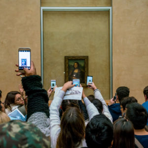
Visitors to the Louvre museum can stare at Mona Lisa for as long as they like; however, billboards are different. You’re addressing a moving audience and you need to grab their attention very quickly. Drivers are your principle audience, but walkers, joggers, and cyclist notice them too.
Since billboards offer massive scale, it’s tempting to fill your billboard with as much as information as possible. You’re paying for the space, so why not squeeze in as much as possible?
Unfortunately, this is precisely the opposite of what you should do. If you cram your billboard advertising with too much information, your audience can’t decide where to focus. Consequently, it muddies your message or even worse, they miss it.
The magnificent 7 rule limits billboard headlines to 7 words, or less. If this seems an impossible feat, consider Apple. Here is the text from some of their most famous advertisements:
“Apple invents the personal computer. Again.” – Macintosh Computer
“45 million songs. Zero ads.” – Apple Music
“Travel simply.” – iPad
Sure, they have an advertising agency to write their copy, but the principles are easily within your reach. Focus on a single idea. Use short, punchy headlines to improve readability and choose persuasive words. They add a subconscious trigger that can lead people to act, instead of just reading your ad.
Create a concise, compelling, and memorable message. You may need to edit your copy many times to reduce it to its essence, but it’s worth it. It increases the likelihood a viewer will notice, remember, share, and act on your message.

TYPEFACE CONSIDERATIONS
Clarity is extremely important. Even when you pare your text down to its most powerful core, there’s no point putting it on your billboard unless the viewer can easily read your copy.
Avoid hard-to-read typeface such as script fonts, novelty fonts with many embellishments, difficult-to-see thin fonts, or ultra-bold fonts that tend to blend letters together into a huge blob.
Additionally, limit the number of fonts you use on your billboard. Many billboards rely on a single highly-legible font. However, in some advertisements you may need two, but that’s plenty. It doesn’t make sense to use many fonts when you’re trying to deliver a clear message. It just makes your billboard harder to read.
Typographers usually recommend the following fonts for legibility, but many more exist and font choice also depends on your design:
Serif fonts: Times New Roman, Garamond, Georgia, Baskerville, Georgia
Sans Serif fonts: Arial, Calibri, Verdana, Tahoma, Helvetica, Lucinda Grande
Marketers also suggest you consider using lowercase letters in your marketing message, instead of all capital letters. Traditional billboards often used all capitals, but many big brands use lowercase since it makes them seem more approachable.
When designing your billboard, consider whether the viewer will see your message and branding clearly from at least 5 metres away, since they’ll be traveling on a roadway or sidewalk. Also ask someone else to review your copy for 5 seconds. Did they understand your message immediately or struggle to sort it out?
COLOUR COUNTS
When you’re trying to find how to build a brand and sell products and services, colour is a very important consideration.
A study conducted at the University of Winnipeg found between 62 and 90 percent of individuals make up their mind about a product or brand within 90 seconds, based on colour alone. It’s not necessarily the colours themselves, but whether they’re a fit for the personality of the product or brand.
Consequently, if you’re marketing off-road vehicles to men you probably wouldn’t use pastel colours. Entrepreneur has a fascinating article that offers in-depth information, but the basic principle is you should align colour choices with your target audience and brand personality.
No matter what colours you decide to use, your background and text must offer high-contrast if you want people to see your message. Basically, don’t choose pale pink lettering on a white background or brown lettering on a black background. No one’s going to see the words.
CREATE AN EMOTIONAL CONNECTION

Mona Lisa has captivated millions of people. Often called “the Mona Lisa effect”, people feel emotionally connected to those famous eyes that seem to follow them around the room. Advertising campaigns that appeal to the viewer’s emotions convert twice as well as those that only rely on rationality according to an extensive study.
Why the difference? We process sensory input much faster than conscious thought and we make decisions based on emotions, not rational thought. Consequently, when your business appeals to the consumer’s feelings you stimulate emotional triggers and action.
Organizations benefit from emotional advertising since it targets a very specific audience. For instance, Activia marketed to young women by telling them when you’re in harmony and feel good about yourself, you can do your best. Their ads weren’t about yogurt, but how their product empowers young women.
Chevrolet Canadaisn’t advertising vehicles – they’re selling stories. It’s not about their cars and trucks – it’s about what every day Canadians do with them so potential buyers can envision how they’ll use them.
Local businesses can benefit greatly from emotional marketing too. For instance, a tire company can remind drivers of dangerous road conditions before the winter season. A lawn sprinkler can stress how many hours the homeowner saves when they don’t need to haul around hoses anymore.
INCLUDE CALL-TO-ACTION
Once people see your marketing message, they should know precisely what you want them to do. Don’t assume they’ll understand – tell them. Luckily, billboards do this very effectively.
A summary of TNS survey data reveals 57% of adult Canadians act after seeing outdoor advertising. Those between 18 and 24 were most likely to act (74%), but those over 55 also responded frequently (45%).
Which Call-To-Action created the most interest? Almost 25 percent said they would visit a company’s website after viewing an outdoor advertisement. Another 22 percent said they would look for more information about a product or service. Yet another 19 percent went to a brick-and-mortar store after they saw the company’s advertisement.
Furthermore, 11% bought the advertised product or service after seeing the advertisement. That’s huge, considering the average conversion rate for global e-commerce is only 2.86%. More than one in ten also shared ad information with friends and family on social media.
EXTEND YOUR REACH
Take inspiration from Mona Lisa and her ability to connect with people in front of her, across the room, and around the world. How do you extend your reach? Based on the above data, it makes sense to include your website address on your billboard design. Make it legible and obvious and consider including an incentive. For instance, you could state “Get 10% off until…” Many people use mobile phones today and access the internet with ease. The easier you make it for them to connect, the more likely they are to act.
Businesses that rely on telephone inquiries such as insurance agencies, real estate agents, and service companies should absolutely include their telephone number. Use a standardized formula for your number such as (123) 123-4567 or 123-456-7890 so it’s easy to read.
If you’re trying to drive people to your brick-and-mortar business, your address is a must. However, directional billboards can offer additional information. For instance, you might advertise “Take Exit 10, Then Turn Left” or add a simple map to your design.
Finally, consider adding your social media icons to your billboard. Tech savvy users instantly recognize Facebook, Instagram, and Twitter logos so encourage them to connect and engage.
According to IBISWorld’s December 2017 report, extending your reach is the primary reason to choose billboard advertising. Instead of hoping your audience sees your advertisement, you put it in areas they frequent.
Since you no longer have to contend with the capital cost of billboards and can rent mini-billboards instead, you can also run longer campaigns to increase your reach. People drive different routes during the weekday than on the weekend and may travel with or without passengers. When you run longer campaigns you reach more people.
UNIFY YOUR MARKETING STRATEGY
Billboard advertising is always more effective when it is part of a unified marketing strategy. It ensures your customers get consistent messages about your company and your brand in every medium.
Unite your customer offers and marketing resources and communicate with them in a consistent way. Whether you choose billboard advertising, email, print, radio, TV, or online ads they should all consistently reflect your brand message and company goals.
MEASURE EFFECTIVENESS
Once it was difficult to track the effectiveness of a billboard campaign. Media companies used statistics to estimate traffic, but business owners could only guess whether increased business was due to their billboard or other factors. That’s all changed.
Today, you can create a digital trail to track effectiveness and ROI. Here are just a few methods you can use.
ADD A PROMOTION CODE
You can easily add a promotion code to your billboard such as “10% Winter” for a specific offering. Encourage customers to mention the keyword when they visit your store or enter the code during checkout if they buy online. Track the promotion code to measure your billboard’s effectiveness.
CREATE A LANDING PAGE OR MICROSITE
Create a landing page or microsite for a specific product or service. Use a short URL that’s easy to remember and include it on the billboard. When they access the landing page or microsite, provide them with further information and a way to buy.
Brick-and-mortar customers can prepay for a service and call for an appointment, or pay for a product and pick it up later. Track impressions and conversions easily and know the traffic comes directly from your billboard.
> SOCIAL MEDIA ENGAGEMENT
Include social media icons on your billboard and offer a discount or bonus when they connect to your platforms. Track likes, shares, comments, and conversions to measure the effectiveness of the billboard design. You can also use a campaign specific Twitter hashtag to measure engagement.
> MEASURE YOUR TAGLINE
When you create a memorable tagline for your billboard campaign, it’s easy to use analytics to see how often people search for the words. Search engines also do a great job of finding your tagline and business when a person doesn’t remember the precise tagline.
> CUSTOMER SURVEY
Include a quick survey on your website and ask brick-and-mortar customers how they discovered your brand. It’s a simple and effective method to measure which efforts have the most impact and your billboard return.
Billboard advertising is a powerful tool to create brand awareness and promote products and services. Just like the Mona Lisa painting itself, mini-billboards cannot be bought and sold but you can rent them! Mini-billboards let you place your message in the best locations to reach your target audience. They also take a fraction of the time to produce, so they’re very responsive to business needs.
Postcard Portables offers many innovative outdoor advertising products to dramatically increase your company’s exposure. We’re not just a sign company – we offer advertising solutions.
CONTACT US ANYTIME – We’re always happy to help!
Blog Search
Recent Blogs
- How Customer Service Brings World Peace
- High five to postcard portables! 5-year cfa franchisees’ choice designation winner
- Hats off to our franchise of the year award winner!
- Wacky hockey facts a successful business should know
- Five Reasons Why Successful Businesses Stink
- BEST BUSINESS BOOKS TO HIDE FROM YOUR COMPETITION
- WHY BUILDING BUSINESS RELATIONSHIPS IS LIKE DATING
- FIVE BUSINESS NETWORKING TIPS YOU NEED TO SUCCEED
- BEST BUSINESS CARD DESIGNS TO SQUASH THE COMPETITION
- BILLBOARD DESIGN TO MAKE MONA LISA SMILE